Case Study: Mathur & Taylor Orthodontics
The situation:
Mathur & Taylor Orthodontics is a trusted, patient-focused practice delivering exceptional care, but their visual presence needed to reflect the same level of professionalism, warmth, and precision patients experience in the office. The brand needed to feel established and credible, while still approachable and family-friendly. It had to communicate expertise without feeling clinical or cold.
What we built:
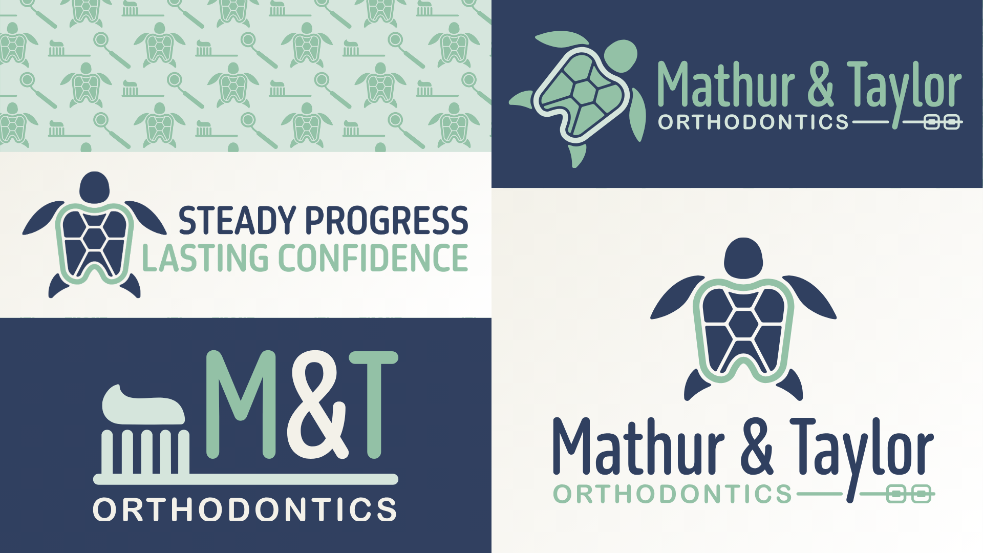
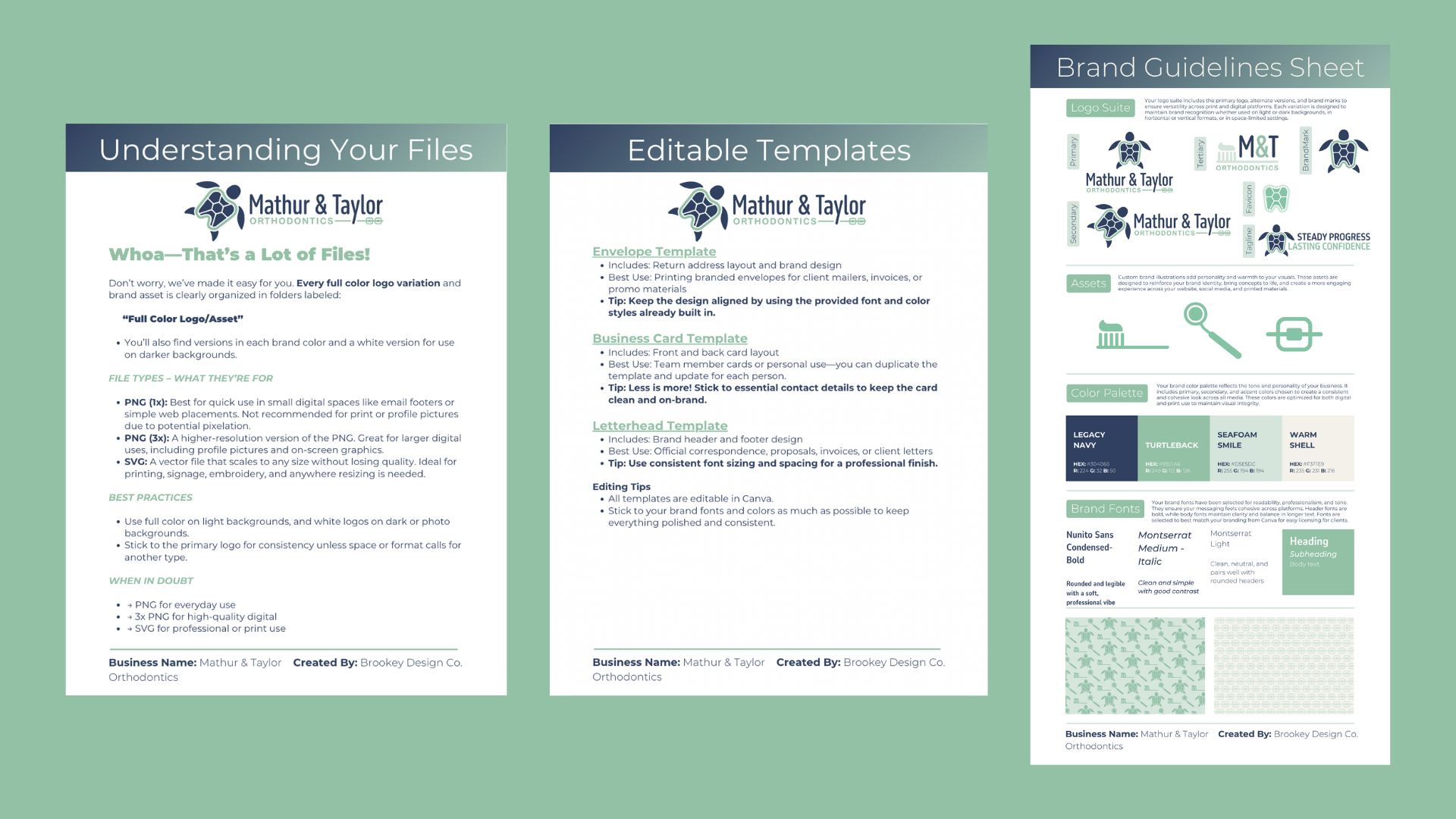
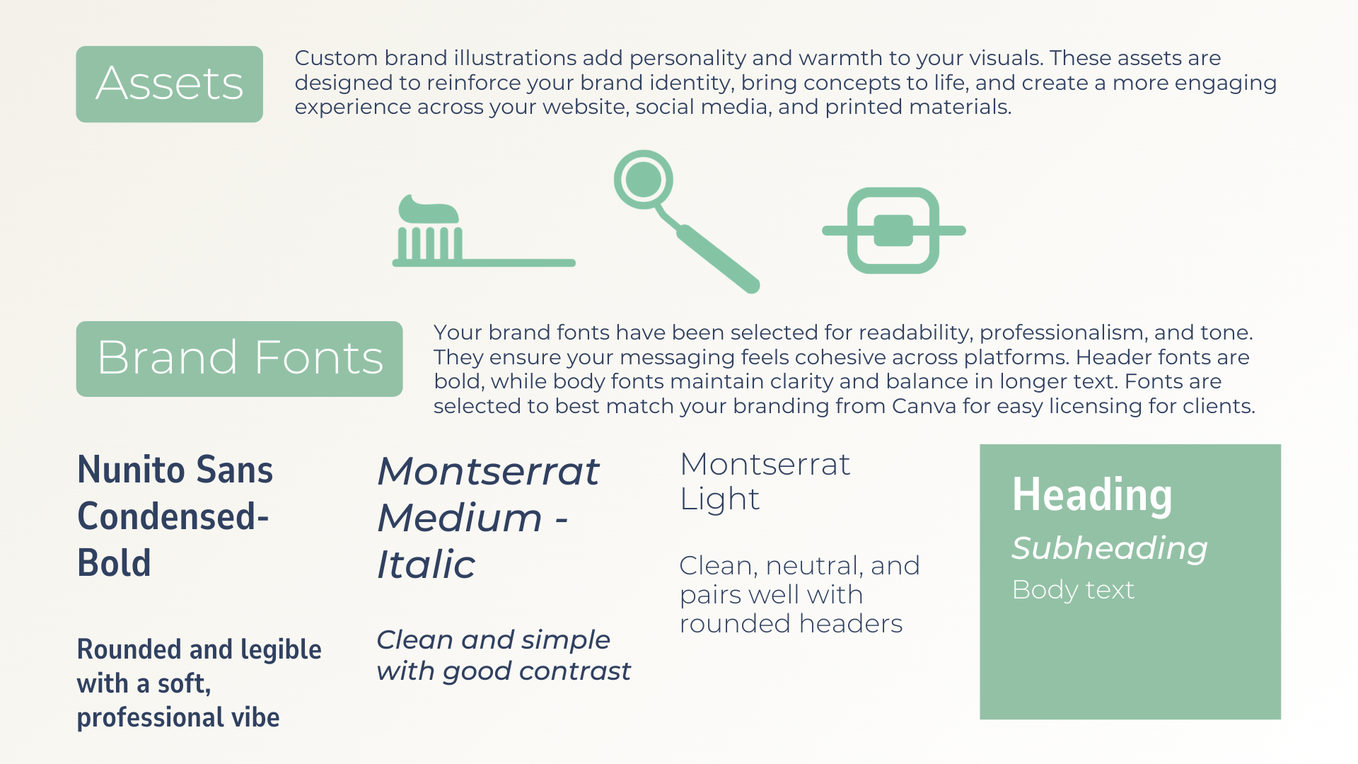
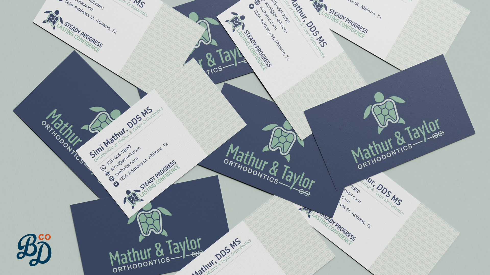
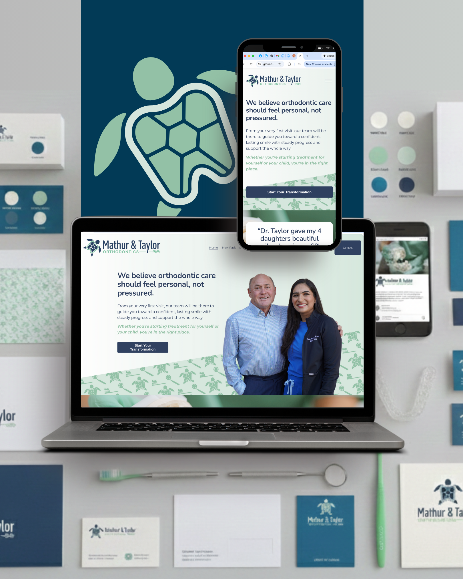
A complete Visual Identity Kit designed to communicate professionalism, warmth, and clinical precision. We developed a cohesive logo system, typography, and color palette that felt modern and trustworthy without feeling sterile or intimidating. The visual direction balances expertise with approachability, reinforcing confidence for both parents and patients. Every element was built to function as a unified system, ensuring the brand feels consistent across the office, website, and every patient touchpoint, not like disconnected pieces.
Where it shows up:
Exterior signage and in-office branding
Patient materials and printed touchpoints
Website and mobile experience
Social media and digital communication
The result:
Mathur & Taylor now looks as established as it operates. The brand sets expectations before a patient ever walks through the door, reinforcing trust, professionalism, and attention to detail. The experience feels cohesive from first website visit to in-office appointment, and the brand does its job quietly: supporting confidence, clarity, and long-term patient relationships.
This is what happens when a visual identity is treated as a system, not decoration.
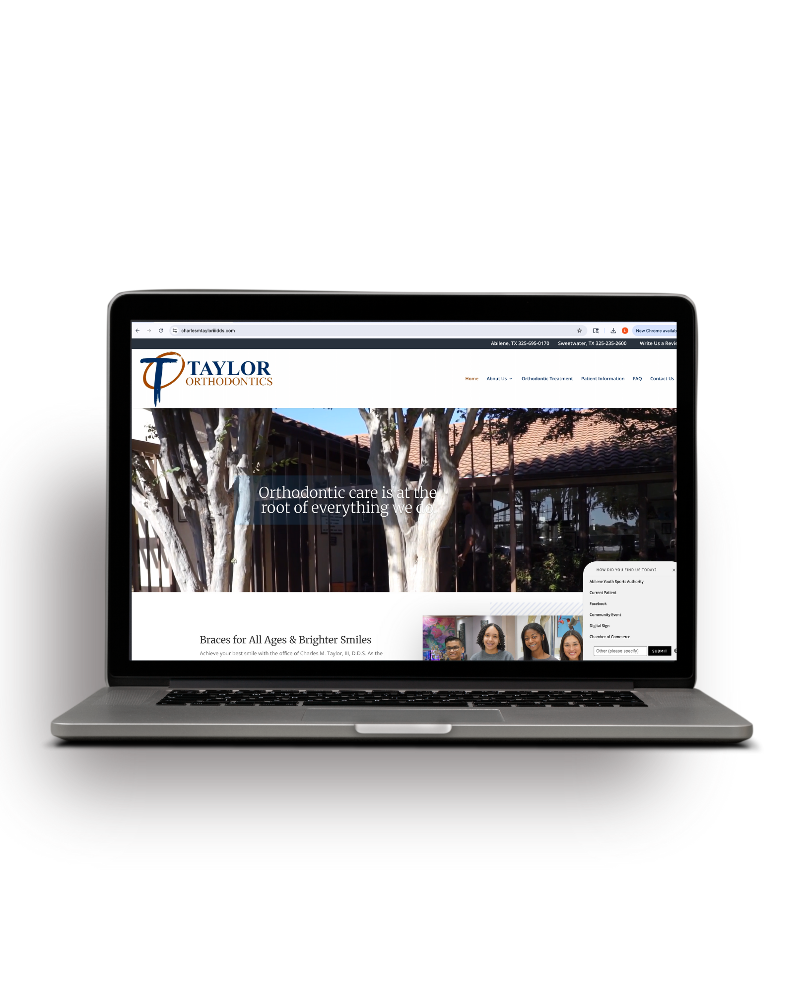
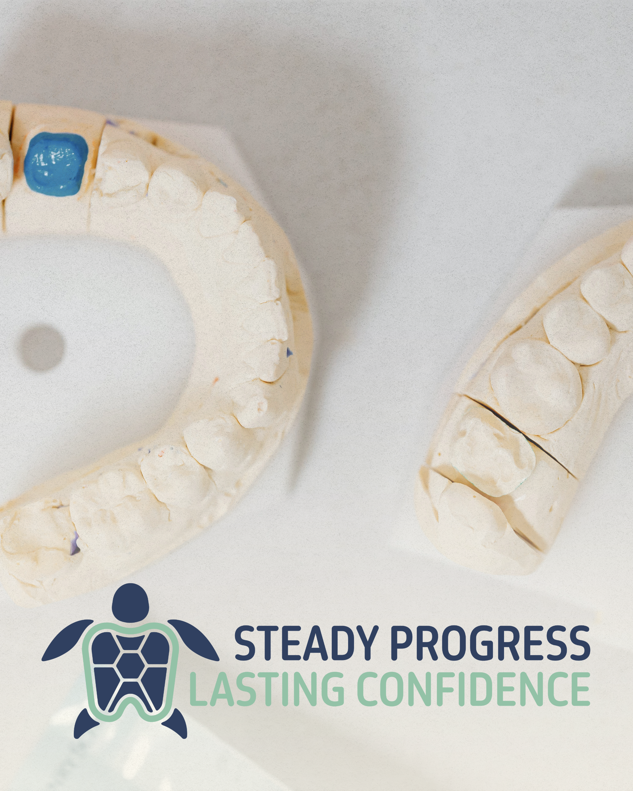
BEFORE
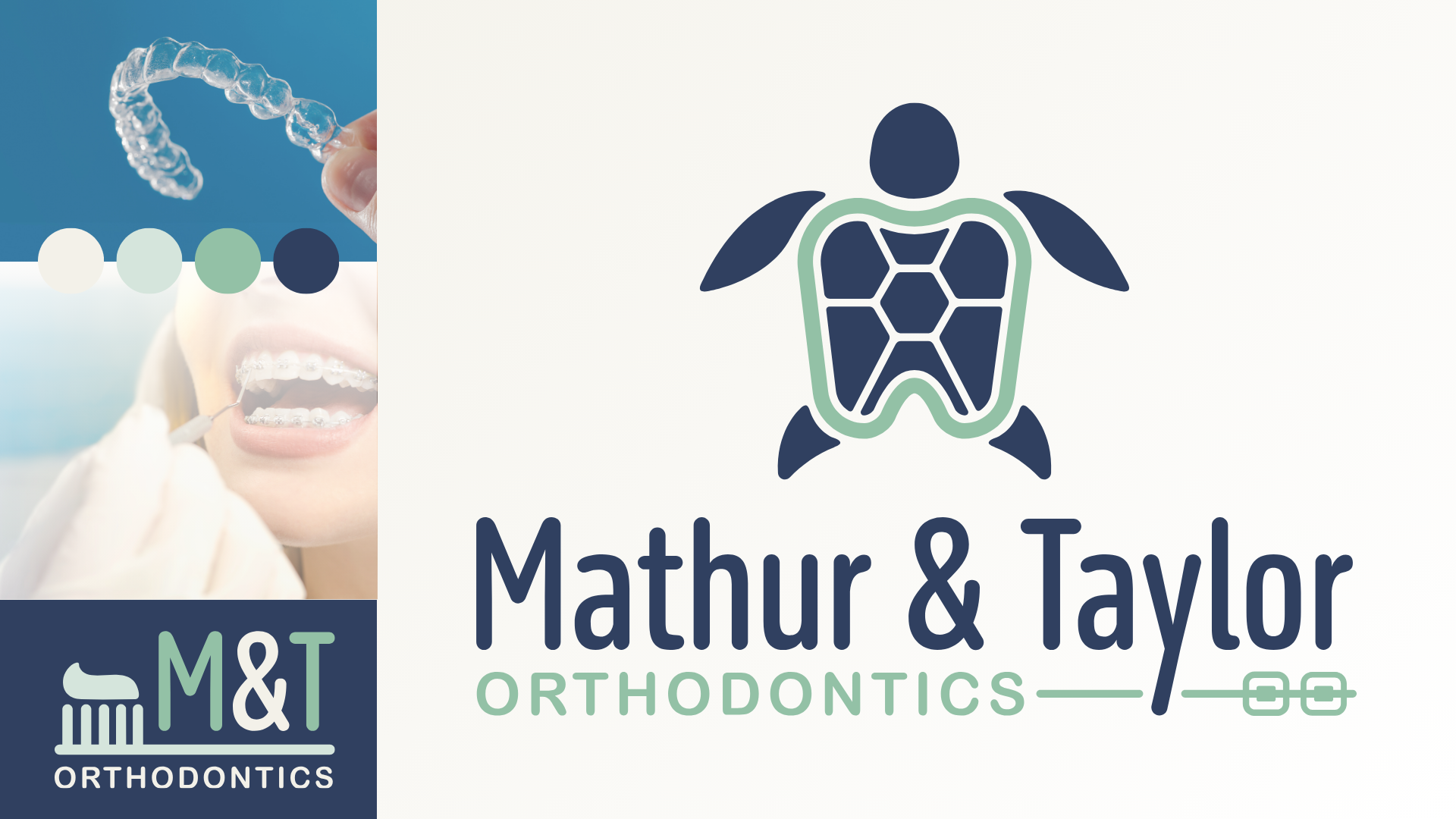
AFTER